This image displays 9 elements which I believe demonstrate how typically conventional my magazine design is. The nine frames include conventions from my cover, contents and double page spread.
I consider my magazine title or masthead to be quite typical of a rock magazine. My inspiration came from the masthead of NME which is written in block capitals. The font I used was Gills Sans Ultra Bold because i liked how sharp the letters appear. Comparing my masthead with NME, I think the two are very similar because they are big, bold and the letters are compacted together. Also the font is very sharp and the letters have a coloured outline. I decided to use yellow because I thought it would appeal to both a male and female audience.
My friend Jade Wilson was my cover model for my magazine. I chose her because she is very photogenic and she has the indie/rock look that I was going for. I experimented with a number of different images for my cover photo and ended up using an image of Jade standing with her head tilted and her arms by her side. I liked the costume she was wearing because it was quirky and looked very indie. I liked the mise-en-scene of the image because it connotes the idea of youth, it is simple but strong. I used a medium shot because I didn't want to use a close up as I thought this might distract the audience from the rest of the page. I wanted my image to stand out but I didn't want it to completely dominate the page and I think I did this well. Alot of the magazine covers I looked at used close up images of their cover model. One particular cover which caught my eye was an edition of Q featuring Lady Gaga. The cover photo is a medium shot and I like it because It doesn't focus too much on Lady Gaga's face, it allows the reader to see what she was wearing which was relevant to the genre of the magazine. Also it allows the reader to interpret her body language as it shows the majority of her body. The body language she uses is very strong and her facial expression is quite dominating.
The mise-en-scene of the images I used on my double page spread reflected the genre of rock because they depicted the band members playing instruments such as the bass guitar. I think the images look very conventional and stereotypical of a music magazine because the majority of music magazines use images of their artists performing.
My sell line circles were an idea taken from the Lily Allen edition of NME. I thought they were a good idea because they are bright and eyecatching meaning the reader will be drawn to read them. Many magazine covers I looked at displayed their sell lines inside of colourful shapes to make them stand out and to add something different to the magazine. Below are three different magazine covers, each a different brand, which have used the idea of using shapes to display text.
The list of bands I used at the bottom of my cover was also an idea I took from NME magazine (example: NME magazine above). I used a list of bands to inform the reader of the bands included in the issue of my magazine without having to write a summary of the article.
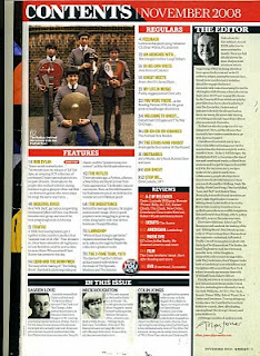
I decided to include an editors note on my contents page as I wanted to take up as much free space as I could. I wanted my magazine to look complex and interesting. The editors note allowed me to give an overview of the magazine issue as I decided to create a weekly issue. This idea came from UNCUT music magzine that I borrowed from college because I liked the layout of the contents and I thought it would help me construct my own. The majority of magazine contents pages I looked at did not have an editors note however the issue of UNCUT magzine (indie/rock genre) I came accross appealed to me and I decided to interpret the idea into my contents.
I used cover photography in my contents page because I recognised that it was used in every magazine I looked at. A typical music magazine always includes the cover photographer at the side of the image or somewhere on the page, in most instances up the side. I wanted my magazine to look professional and I wanted my images to look genuine so I created a fictional photographers name and put this at the side of the image of my cover model Jade on my contents page.
Although I wanted my magazine to look conventional, I liked the idea of using different or unfamiliar conventions to make my magazine look interesting. I found an issue of NME magazine which had a voucher on the contents page for 'Club NME'. I thought the voucher looked effective so I decided to make my own voucher for 'Passion Rocks Nightclub'. I even created a logo using photoshop rather than using a found image.
I thought it was very important to include a website link in my magazine to demonstrate the idea of new media and also because the magazines I looked at had a website. I included the website on my front cover and on my double page spread with a direct link to the latest news on the band my article was about, 'Bleeding Mascara'.


