Thursday, 3 May 2012

Q3-What kind of media institution might distribute your media product and why?

After researching and studying a variety of magazines, I have drawn the conclusion that 'NME' is most similar to my magazine 'SYNTHESIS'. The weekly magazine is published by IPC media, the UK's leading consumer magazine and digital publisher (http://www.ipcmedia.com/). Emily Hutchings, the current publisher of weekly titles 'Now' and 'Soaplife' was also recently appointed as publishing director of music 'NME' and 'Uncut'.


Although I am not a regular reader of NME magazine, I was aware of the magazines existence as it is a hugely famous magazine dedicated to covering the musical genres indie/rock. NME was always a magazine I had in mind and referred to during the making of my magazine as it shares the same genre. I also used some of the conventions of NME in my magazine as I liked the different layouts it uses. An online version of the magazine http://www.nme.com/ was launched in 1996 and is now the world's biggest music site with over 7 million users per month. I believe this is an indication of the growing popularity of the internet and predict because of this, the number of paper copies will be reducing. 


I think that this particular issue of 'NME' magazine is similar to my magazine because of the contrasting colours red, white, black and yellow. Both my magazine and this one have quite a complex cover with multiple sell lines and the use of different fonts. I believe this is a suggestion that the audience of NME would be similar to that of mine. If my magazine was professionally published, I would only offer it's availability in large supermarkets such as 'ASDA' and retailers for example 'WHsmith'. I would not want my magazine to be displayed in small independent newsagents as it would not be seen by many people. I would also like to create a website allowing readers to subscribe and order home delivery like NME website. If my magazine was successful, I would like to introduce an app as NME have done so.


Image above shows the NME app available for iphone's, ipad's, ipod's and other android phones.

Q2-How does your media product represent particular social groups?


The postures of both women are similar in the sense that they both adopt a forward facing pose toward the camera with their arms by their sides. Both images are also medium shots. Although their facial expressions are different in that my model is smiling whereas Shakira expresses a more dominating serious look, I believe I can draw numerous similarities between the models. They are both tanned (Shakira's skin appears to be glowing because of the brighter lighting) and wearing eye make-up to high light their eyes therefore aiming for a beauty shot. Jade chose an up-do wearing a bun to allow more focus on her facial features and body language and also to suggest tidiness and sophistication. In contrast, Shakira has a loose hairstyle wearing her hair down and wavy to create a more defiant independent image. Both myself and Rolling Stone chose to shoot our models from the front so that they face forward and look directly to the camera. This allows the costume of the models to be seen more effectively than shooting the image from the side. I liked Jade's costume because I thought it reflected the genre of my magazine indie/rock, this is because the outfit is simple and casual, yet quirky and the top is colourful representing a younger audience. Shakira is also wearing an outfit that reflects the rock genre of the magazine, this is because she is dressed completely in black and has her top unbuttoned to express attitude. Both Jade and Shakira are wearing minimal accessories, Jade wears two bracelets on her right hand and a ring on her left and Shakira wears a bracelet on her left hand. Although Shakira is famously known for being a pop star, she appears to look like a rock star because of the context of the magazine and the way she has been portrayed with respect to the sell line. I think both images reflect the different beliefs and values of the models. I assume Shakira values personal appearance and presentation highly because of the perfect airbrushed look she evokes in the image. Jade however values her style and individuality as this is a way of expressing herself. Although this image of Jade is the original, the background of both images on the cover of each magazine is plain and white giving the impression that the models are in front of a white screen. In these images, the models are seen to have different personalities, Shakira looks independent and fierce while Jade comes across as down to earth. Overall, I believe that these elements demonstrated by the images represent a normal young social group. My primary target audience is 16-24 year olds and I believe the image I have used demonstrates this well as it shows a stereotypical young girl.


The video below is a slideshow of front covers that have used a medium shot of their cover model. I think each cover is equally appealing as I like the different postures and facial expressions used by each of the cover stars. 

                            
Make a video of your own at Animoto.

Monday, 30 April 2012

Q1-In what ways does your media product use, develop or challenge forms and conventions of real media products?


This image displays 9 elements which I believe demonstrate how typically conventional my magazine design is. The nine frames include conventions from my cover, contents and double page spread.

I consider my magazine title or masthead to be quite typical of a rock magazine. My inspiration came from the masthead of NME which is written in block capitals. The font I used was Gills Sans Ultra Bold because i liked how sharp the letters appear. Comparing my masthead with NME, I think the two are very similar because they are big, bold and the letters are compacted together. Also the font is very sharp and the letters have a coloured outline. I decided to use yellow because I thought it would appeal to both a male and female audience.


My friend Jade Wilson was my cover model for my magazine. I chose her because she is very photogenic and she has the indie/rock look that I was going for. I experimented with a number of different images for my cover photo and ended up using an image of Jade standing with her head tilted and her arms by her side. I liked the costume she was wearing because it was quirky and looked very indie. I liked the mise-en-scene of the image because it connotes the idea of youth, it is simple but strong. I used a medium shot because I didn't want to use a close up as I thought this might distract the audience from the rest of the page. I wanted my image to stand out but I didn't want it to completely dominate the page and I think I did this well. Alot of the magazine covers I looked at used close up images of their cover model. One particular cover which caught my eye was an edition of Q featuring Lady Gaga. The cover photo is a medium shot and I like it because It doesn't focus too much on Lady Gaga's face, it allows the reader to see what she was wearing which was relevant to the genre of the magazine. Also it allows the reader to interpret her body language as it shows the majority of her body. The body language she uses is very strong and her facial expression is quite dominating.

The mise-en-scene of the images I used on my double page spread reflected the genre of rock because they depicted the band members playing instruments such as the bass guitar. I think the images look very conventional and stereotypical of a music magazine because the majority of music magazines use images of their artists performing.

My sell line circles were an idea taken from the Lily Allen edition of NME. I thought they were a good idea because they are bright and eyecatching meaning the reader will be drawn to read them. Many magazine covers I looked at displayed their sell lines inside of colourful shapes to make them stand out and to add something different to the magazine. Below are three different magazine covers, each a different brand, which have used the idea of using shapes to display text.


The list of bands I used at the bottom of my cover was also an idea I took from NME magazine (example: NME magazine above). I used a list of bands to inform the reader of the bands included in the issue of my magazine without having to write a summary of the article.

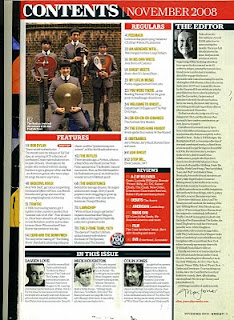
I decided to include an editors note on my contents page as I wanted to take up as much free space as I could. I wanted my magazine to look complex and interesting. The editors note allowed me to give an overview of the magazine issue as I decided to create a weekly issue. This idea came from UNCUT music magzine that I borrowed from college because I liked the layout of the contents and I thought it would help me construct my own. The majority of magazine contents pages I looked at did not have an editors note however the issue of UNCUT magzine (indie/rock genre) I came accross appealed to me and I decided to interpret the idea into my contents.


I used cover photography in my contents page because I recognised that it was used in every magazine I looked at. A typical music magazine always includes the cover photographer at the side of the image or somewhere on the page, in most instances up the side. I wanted my magazine to look professional and I wanted my images to look genuine so I created a fictional photographers name and put this at the side of the image of my cover model Jade on my contents page.

Although I wanted my magazine to look conventional, I liked the idea of using different or unfamiliar conventions to make my magazine look interesting. I found an issue of NME magazine which had a voucher on the contents page for 'Club NME'. I thought the voucher looked effective so I decided to make my own voucher for 'Passion Rocks Nightclub'. I even created a logo using photoshop rather than using a found image.

I thought it was very important to include a website link in my magazine to demonstrate the idea of new media and also because the magazines I looked at had a website. I included the website on my front cover and on my double page spread with a direct link to the latest news on the band my article was about, 'Bleeding Mascara'.


Thursday, 26 April 2012

Feedback

                                           
This is the feedback I received from the people in my class for my first attempt at my music magazine cover. I think it was very helpful finding out what other people thought of my magazine and the advice I was given really helped me improve my work. I used my feedback throughout the process of improving my cover as I referred back to it often and it helped me improve the standard of my first draft.


This image shows my first attempt at creating my magazine cover and also the notes I found most helpful. The majority of the class thought my image was too bright and I was also told to make my masthead bigger. I took on board the advice I was given and increased the size of my masthead. I also changed my image as the exposure was too bright however the second image I chose was blurry so I had to experiment before I found an appropriate image. Also, I changed the genre of my magazine from 'Pop' to 'Rock' and the first image on my magazine did not reflect the 'Rock' genre.

Masthead


 I have decided to position my masthead behind the image of my cover model as demonstrated by these covers of NME and Q magazine. I prefer this layout  as I think it will draw the readers attention more to the cover model and the cover story. If i was to bring the masthead to the front, this would distract the readers from the cover image and would bring more attention to the masthead. As my aim is to create a strong cover story, my cover image must stand out and I feel this layout will create my desired effect.

Thursday, 19 April 2012

Magazines I looked at for ideas

Before I began creating my magazine, I looked at a range of magazine issues to help me generate ideas. The issues I studied in particular were predominantly from 'NME' and I highlighted a number of techniques I wanted to use in my coursework.

Front cover
I used animoto to create a 30 second slideshow demonstrating conventions that inspired my final front cover.

Try our slideshow creator at Animoto.


Contents page


Text from image: I looked at a number of magazine contents pages to try and generate ideas for my own magazine and I found that this issue of NME particularly caught my eye because of the vibrant colours and use of different fonts. The inspiration for my voucher came from the Club NME voucher at the bottom of the contents page. I thought the idea was different so I decided to create my own voucher on photoshop rather than using a found image. Constructing the voucher with only tools from photoshop allowed me to be creative, inventive and also furthered my understanding of the software.

Double page spread


Text from image: This double page spread appealed to me because of the contrasting colour scheme using red, black and white. I also liked the idea of the images in black and white because I thought it demonstrated the rock genre. The feature I liked most was the list of upcoming tracks with descriptions of each and a preview of the lyrics. I thought this would look effective on my magazine so I created my own list of upcoming tracks. This allowed me to be creative as I had to generate a suitable album name that reflected my magazine genre and the band that my double page spread was about. I also had to invent my own song lyrics.

Monday, 7 November 2011

Double-page spread analysis

This double page spread features the band My Chemical Romance, an American rock band. This particular spread appealed to me because it demonstrates the genre of rock which i intend to interpret into my magazine. One feature that i particularly like in this spread is the use of black and white images. The spread consists of 4 images in total, one large image that covers the full first page and 3 smaller images starting before the centrefold and taking up the bottom right corner of the second page. The large image is an action shot of the lead singer and is evidently the central focus of the piece. The smaller images are also action shots of the other band members giving the audience more to look at and allowing a balance of text and images. The black and white effect contrasts nicely with the black background and allows the red text to stand out effectively. My favourite part of this magazine spread is the heading, i think the font and use of capitals gives it a rock and roll style. I also like how it is placed over the centrefold and i particularly like that 'the best MCR' is larger and in a different colour to the rest of the heading.

This double page spread features the female pop artist Lily Allen. This spread stood out to me because of its simplicity. The feature i like most is the magazine cut-out style font of the heading and the contrast of the colours black and white. The use of these two colours primarily means that the spread does not clash and look over crowded and also allows the random red words highlighted in the text and the red of the artists shirt stand out on the page and give it a sophisticated look. I also like that the image has a cut-out effect and  goes over the centrefold, colliding with the heading of the article. I think that in this spread, the use of one image is sufficient as it is large and takes up a full page.

This double page spread features 'The Vaccines', a British indie rock band. The main feature of this spread is the image which spreads over the centre fold taking up three quarters of the double page. I like that the image has been edited to a sepia tone, giving the image a dark brown-grey colour and making it look old and washed out. I also like that 'the vaccines' has been written in bold capitals to make it stand out and dominate the rest of the text. The simple black text on a white background and the dull tones in the image mean that the large blue letters, blue sub heading and random blue shapes accross the double page stand out and allow a burst of colour.